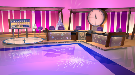
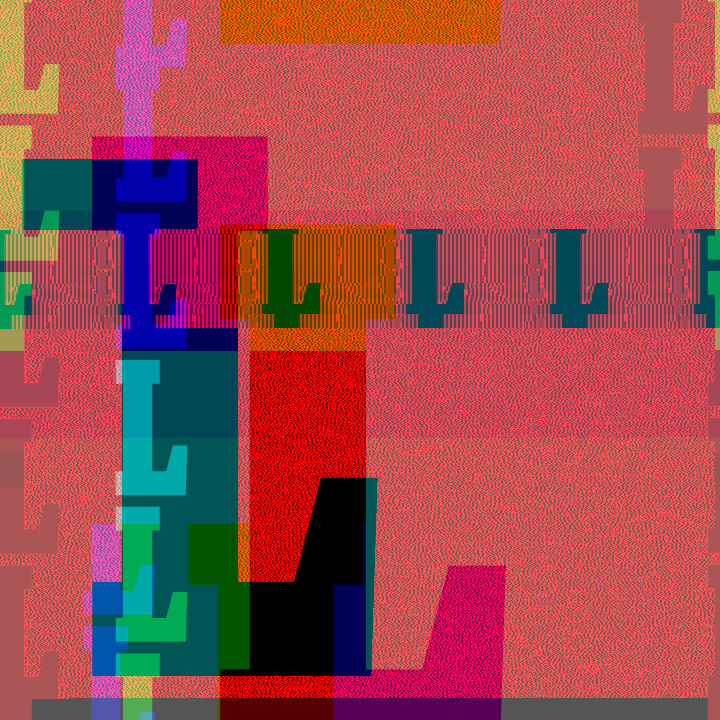
Here’s some Blockbusters I’ve been working on, which, rather fittingly, started out as a collaboration but has taken a solo turn. It’s a 3D model of the set based on the 1994 series, complete with the iconic board and hot spot with flashing lights.

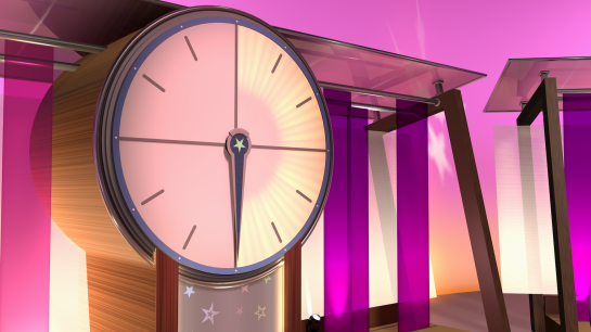
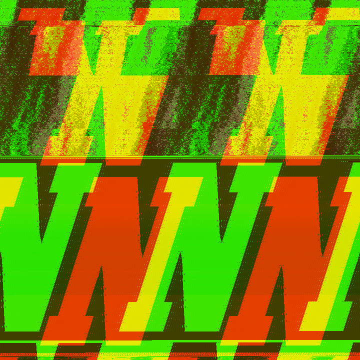
The friezes atop the set couldn’t be overlooked – multiple figureheads were installed over the show’s tenure, depicting notable figures and celebrities; Zeus remained constant, watching over Bob Holness. Above is my terrible attempt at recreating one with Bob himself; after that, I resorted to using screenshots from clips.

The 1994 series of Blockbusters – the last under Holness – was a curious one. ITV officially axed the show the previous year, as it appears many regions preferred the likes of Home and Away as pre-news filler, and so Blockbusters had rather fallen out of favour, either shunted to early afternoons or simply not shown at all. It was promptly picked up by Sky and returned in April 1994, now in a prime 7 o’clock slot. Though the theme tune received an update, it was, for all intents and purposes, the same show: same host, same titles, same set, same production team, and only minor tweaks to the format (reverting to five gold runs, and the occasional “bonus letter” promising an extra fiver).

What’s slightly odd is that, despite now being a Sky programme, a few ITV regions showed it as though it had never been axed to begin with. Such an arrangement may well have continued, but alas it seems Blockbusters failed do the business for Sky and no further series were made. A bit of a messy end to a legendary programme.

Here’s the iconic game board on the set model, complete with an updated version of my font:

The very first series, from 1983, has just finished showing on Challenge, and they are a bit of a guilty pleasure – not only for the comfiness of it all and Bob being awesome, but getting a laugh from some of the fashions and hairstyles, demonstrating that, yes, people did look a lot older back then. Happily, it appears they’re following up with series two, so there’s more to look forward to.

Wheel of Fortune came back to ITV last weekend. There’s some inspiration to make this model – which, coincidentally enough, was started mere days before the revival was announced back in June – vaguely presentable and get a render out of it. For here, we have a representation of the classic American look for the show.

The wheel was almost entirely completed last summer. There were lots of crazy spaces on the American wheel that never appeared on the UK version, although of course, where they had “Surprise” we had “Brad’s Box”, where you might stand a chance of winning a Walkman, a digital watch, or something else from the Argos catalogue of the day.

The board, however, was where things halted last time, but I managed to cobble something together using my previous attempt at the original UK counterpart. The fan motif took a bit of wrangling, but once the lights were in place things started to come together. The letters on the blocks are also using a custom typeface.

I’m surprised it has taken this long for Wheel of Fortune to return, given how popular it was back in the day. It’s a simplistic game, more sparkle than substance… hard to screw up, surely?

Well, what we have is very much an import of the American version, which has its pros and cons. But, ultimately, it turns out that a whole hour of Wheel is just too much; I was flagging during part three and had pretty much lost interest by the end. It worked so much better – and continues to work Stateside – as a quick, fun half-hour. Also, as much as I like Graham Norton as presenter, I found it quite empty without a co-host – I realise this is essentially a pointless role these days, what with the video board revealing the letters itself, but having someone to bounce off might have livened things up a bit. And this programme really needs livening up.

Oh well. At least ITV’s other American quiz show revival, Jeopardy, is looking much more promising. I was more invested in that one, and I’m glad to say I’m hooked!

Here’s the subject of the puzzle by the way, if you need to inject some eighties energy into a dreary January:

Yes, we’ve been watching The Crystal Maze again over Christmas.

I thought it would be fun to try and recreate the fancy little animation that appears at the end of the opening titles, as well as into and out of commercials. Made back in 1992 for the show’s third series – and a vast improvement on the original design – I can imagine the crystal in particular was a time-consuming process which required lots of resourceful thinking and/or trickery. I found it tricky enough decades later!

That’s twenty seconds of time inside the Crystal Dome.

This is a brand new crystal model. I’m not sure it’s perfectly accurate, but it is much closer than my previous attempt, which better resembled the shape of the Crystal Dome. Once I had the model and scene down, I attempted the caustic light emanating from the crystal. Several methods were explored but, as you can see below, it did not go well, so I proceeded without it. It does look rather bare without it, so I’ll probably have another go at some point.

Simulating the ripple effect as the crystal rose was, happily, very easy. It’s just a Formula displacer. My only complaint is that it’s a hair too slow, and I never figured out how to speed it up. The big boom at the end could probably also have been executed better, but dealing with a lens flare, I was wary of blinding people. Possibly a speedier explosion with a stronger Random effector to give a bit more, well, randomness.

So, overall, lots of fun here, but plenty of areas to refine for another go – whenever that may be.

Happy New Year to you. If you’re one of the six or so still visiting at this point, you’re obviously the decent sort. I cannot look into a crystal ball, but I hope 2024 is a happy and fruitful one for you.

It just about says it all for 2023, really – one of the few projects I actually did complete during the year, I put away for December and then totally forget to post. Here we have a rebuild of the 2003 Countdown set, in what I hope you’ll agree is a significant improvement on my last attempt from way back in 2016.

And what’s more, this one’s done up all nice and camp for Christmas… 2007. At that time, the show was hosted by Des O’Connor and Carol Vorderman, both blissfully unaware that they were soon to be effectively booted out (along with the set, as it happens) for cheaper models.

It was late March and into April when I made this, so you can forgive the memory lapse. But yes, with the exception of the clock, everything was modelled from scratch, working with dozens of reference pictures and clips. The overall scale looks much better than the last attempt, though perhaps the “wall” behind the letters board should be slightly longer. That’ll be covered in the 2030 attempt, I suppose.

Something I did quite enjoy was working with the reflective star stencils dotted all over the place, and not just for the camp. Setting the reflection channel to a spectrum of colour with a strength over 100% worked quite well, with different appearances from different angles. Still a satisfying feature of 3D modelling for me.

Even the big ole clock itself, mentioned previously, has been tweaked a fair amount beyond the festive decoration. The biggest improvement? Probably going to the trouble of varying each bulb’s brightness so that some are dimmer than others. A relic from the show’s inception in 1982, I believe it used incandescent bulbs, hence individual segments wearing out was often noticeable. Thanks to one Adam Beach, fellow Countdown Set Enthusiast, for the suggestion.

And here’s the clock running, showing off the set from multiple camera angles. As if you need telling, the clock is ticking, the countdown to Christmas almost over…

At last! The snowy landscape drawing I’ve been envisioning (and ultimately sidelining) for many Christmases has emerged. And it was completed in good time. What’s going on?

It has been a tough year, probably one of the toughest in fact, which has left me feeling drained and uninspired; I’ve created almost nothing, which in itself is a bit scary as that has always been an outlet. Maybe it’s time for a new hobby?

With all that said, I’m actually looking forward to Christmas this year, so that may be why the card finally materialised. A lot of people put their decorations up extra early, so I’m probably not alone in my mindset. There is still joy to be had, so let’s grab it when we can, then on New Year’s Eve we can give 2023 the middle finger, knowing it can and will never return.

Merry Christmas and best wishes to you all, whatever you’re doing, whatever you’re celebrating.

Now is the time, I’ve decided, for another round of glitch art using Audacity. I tried it before using wrestlers; this time, we’re using lettering – a knock-off I cut a few months back, based on a certain wheel-based game show. Maybe, one day, I’ll see to actually completing said project on said game show.

It’s kind of appropriate, as messing around with Audacity in this way is very much a blind spin of the wheel; you might have a vague idea of what’s going to come out, but you simply can’t know for sure. But still you try, and in turn, end up with about a hundred exports after spending the whole afternoon playing with it.

Here are some of my favourites. Some have had a bit of a helping hand from Photoshop, adjusting colours and contrast, but at their heart they are all products of Audacity’s editing tools.

It is quite a fun process, thanks to that element of surprise.

If you want to have a go, the tutorial here is quite helpful, even if many of the pictures seem to have disappeared.

My apologies for any fried eyes and headaches brought on by the colours used. I don’t normally go this mad, tending to stick to black and white, but felt like colour was rather important this time around.

Well, hello you – how are we? I’m still here, just about. There hasn’t been much excitement happening at this end and the summer was very much one to forget.

A friend of mine has been working on some pixel art lately, and this compelled me to look back at some of the stuff I made in years past. That, combined with a quick session of WrestleFest, resulted in what we have here; it’s just another way of showcasing some of my sprite attempts – in this case, the Undertaker ones – on a different platform.

While there are no new sprites in here – and Gene Okerlund reporting from his desk is taken directly from WrestleFest itself – it was some much-needed video editing practise. I got a version rendered and uploaded to YouTube, only to be reminded on publishing that the Shorts player has the title and icons slapped on top of the video, rendering my text unreadable. To say I was annoyed would be an understatement! That’ll teach me for jumping in. I had to readjust the whole composition, which ended up taking about two hours, and upload again; you could say it was quite the undertaking if you wanted to. But I got there in the end.

Now that I have the framework, I may redo it with some of my other sprites, so keep an eye on YouTube if you’re that interested.

Yes, the Game Show Marathon is back, starting on Saturday. Twenty-four games back-to-back, once again raising money for Child’s Play. Last year they raised more than $10,000, so it’ll be interesting to see if they can match or even surpass that this time.

You’ll be able to watch and/or donate here. I’m sure they’ll be available on YouTube afterwards, if you are that way inclined.

It looks like they’re trying several new ones this time around. Here’s the line-up in BST:

5 PM – America Says
6 PM – Split Second
7 PM – Person Place or Thing
8 PM – Switch
9 PM – Talk About
10 PM – Jeopardy!
11 PM – Moneybags
12 AM – Win Dave Mattingly’s Money
1 AM – The Wheel
2 AM – The Weakest Link
3 AM – 1000 Heartbeats
4 AM – Mock the Week
5 AM – Mastermind
6 AM – Match Game (Blankety Blank)
7 AM – Countdown
8 AM – Press Your Luck
9 AM – Who Wants To Be A Millionaire?
10 AM – Quizmania
11 AM – Tic Tac Dough
12 PM – Super Dice Q
1 PM – Wheel of Fortune
2 PM – All Clued Up
3 PM – Concentration
4 PM – Deal or No Deal

Here’s Countdown from last year, featuring snazzy graphics co-created by yours truly:

And a momentous finale in Deal or No Deal!

What if Doom looked a bit different?

The idea for this just came to me while watching a review of a top-down, maze-style Batman for the TurboGrafx-16 (PC Engine), based on the 1989 film. Other than some impressive cutscenes between levels, the game, while not terrible, wasn’t anything amazing; these days, it appears to be remembered as an “interesting” novelty – if it’s remembered at all.

So, why not take one of the most popular games of all time and see how it looks that way?

I cut a screenshot of Batman into a grid and used this as the basis for my graphics, with the addition of diagonal walls for some added “wow” factor – it’s 1993, guys, Wolfenstein is so last year! It was quite fun trying to make smaller, more pixelated counterparts of famous Doom textures and I like how some of them translate to the smaller scale. Seasoned players may note the lack of the tan wall textures that were ever-present in the game’s first episode; I did attempt them, as you can see below, but I don’t think I did it justice. Too wide.

The monsters themselves were admittedly just scaled down versions of the original sprites, cleaned up a little.

Next, I made a “maze” using the base walls (those yellow ones at the top) before layering over with texture. Shadows and lighting were then layered over that to create the final image. I’ll let you decide whether a working game in such a style would have been a success.

Here’s how it would crop on the actual console, depicted at twice the native resolution, and without consideration for any kind of HUD or status bar:

Finally, here’s a review of the Batman game that inspired me:

In yet another mockery of legendary TV presentation, I attempted to recreate the 1988 Anglia Television flag ident. A somewhat divisive rebrand, seeing off the Anglia knight after so many years, it is however one of the more memorable ones for me, having grown up in the nineties. Mr. Bean and Interceptor are what spring to mind upon seeing this.

Achieving a faithful flag would mean delving into those fearsome cloth and simulation effects for the first time for a while, although, saying that, it wasn’t actually too hard to get the flag in place. It’s funny how I remember these things from seven years ago but can’t remember what I did last week. But I’m sure that’s not just me.

As you can see, once the flag was flying it took a fair bit of wrangling, and there were some unpredictable and hilarious results. But eventually, something reasonable came out in the wash. I do think it could do with a bit more oomph with regards to the turbulence, but it seemed to be a very fine line to tread. It was a lot of trial and error adjusting wind speed, turbulence, gravity, lift and more. I can’t say I really knew what I was doing!

One setback was that fixing the side of the flag in place meant that it couldn’t be moved, so I had to settle for the static version of the ident; originally intended was a version wherein segments move into place to form the flag. It still allowed me to alternate the segments, which was done using multiple alpha layers fading into one another, removing the pieces as required to create a sequence.

For a day’s work, it has come out quite well. I’m definitely going to return to it, to see if I can improve the flag’s motion, and also see if I can find a way to create the “proper” version with pieces moving in.