Archive

Monthly Archives: January 2016

herringfleet-2bIn yet another lurch away from any kind of propriety as far as Time-Tested is concerned, I left Reddit Gets Drawn, and also went further into Corel Painter, this time having a look at its pastels. Why ever not pick a medium with which I am frighteningly unfamiliar and far from exceptional? One day I might post my oil pastel self-portrait from my GCSE exam a good few years ago… stuff of nightmares, it is (and I mean even more than I deserve from a portrait!).

With that slight tremor, I moved away from portraiture and decided to make a pastel landscape instead. This is Herringfleet Mill, a smock mill situated just outside of Somerleyton in Suffolk. Standing beside the River Waveney, and quite a way from road or rail, it is a wonderfully peaceful setting, and it’s no surprise that it has become such a hot pick for photographers. It’s also one of the very few broadland mills that can still work – quite a treat it is to see those sails turn, though, one mustn’t stand too close, as I did once; as the structure is quite small, the sails almost clip the ground, never mind your noggin!

In another departure from the norm, I wasn’t sure how long I was going to give myself for this, but ‘finished’ – or rather was exhausted – at just under two and half hours. To begin with, I tried to force ‘expressive’ by using my non-dominant (right) hand, which explains the sails. The blocks of colour fell quickly; a huge chunk of the time was spent blending, nitpicking and adding strokes here and there – I’ll let you be the judge of whether you think that a success or not! It’s produced something very different, and with hints of loosening up in that I disobeyed the photograph on many elements (though there’s a long way to go in that regard – I just need to dredge up the courage). I’m uncertain about the result compared to my usual, but I guess that’s to be expected. Twas fun, anyhow, and Corel once again proved its impressive worth.

Wheel be ba.. oh I must stop doing that. See you (wheel) soon… in February, I expect!

cyberdemon-1We end our journey through the hellacious parade of Doom beasts with the biggest of them all – the dreaded Cyberdemon. This ghastly, skyscraper-esque, Minotaur cybernetic doesn’t have a left forearm – it has a super action rocket launcher instead. How handy.

The Cyberdemon is not actually the final boss of the game – that honour goes to the Spider Mastermind, who kicked off this little impromptu series here. He does, however, patrol the last level of the second episode, The Shores of Hell, set on Deimos. In a similar setup to the Baron of Hell face-off of episode one, the map Tower of Babel is brisk and quiet – and worryingly generous with armor, stimpacks and ammunition – until you enter a courtyard, and basically run right into this hideous creation. Once awoken, his strides make a booming impact on the ground – the sound of that getting nearer is something you really don’t want to hear.

Meet_cyberdemon

Well, that’s you over.

Needless to say, if you’re caught off guard, his rocket launcher is going to see you off immediately. I’ve always thought the Cyberdemon tougher to best than the Spider Mastermind – it moved faster, was leaner and thus harder to strike at a safe distance (at least until you discovered how to ‘circle strafe’ – basically, run rings around him firing incessantly, while avoiding the rockets) and had an attack which could seriously wound you even if he didn’t actually hit you – Doom was one of the first games to factor in blast damage for explosive weapons (though the Cyberdemon, tsk, wouldn’t you know it, is immune!) It also has health of 4000%, higher than the Spider Mastermind (3000%) and indeed most of the other enemies put together, so on meeting, be prepared for one almighty onslaught.

With the defeat of the Cyberdemon comes the end of our journey to Hell – I think these four are the most iconic characters of the game. I thought I’d throw them all on a single image, just to give you some idea of the varying scales of each of the monsters covered, as the single portraits don’t necessarily do them justice:

doomsizes-1

It’s been a lot of fun revisiting a childhood staple of mine (even though it shouldn’t have been such, I know.) and it’s been an enjoyable challenge ‘upscaling’ masses of pixels into a smooth sketch. I might look at other games in the future, though I’m struggling to think of any with such an impressive cast as Doom.

skymaster0015Back to the theme park we trot for another frolic with the third dimension. This time we have The Skymaster – not an exclusive moniker; the most common I found in researching was the rather more ominous Kamikaze. This contraption turned up in the mid 80s and acts rather like a swinging pendulum, slowly but surely swaying back and forth, more and more until its momentum is such that it can do a full 360. Or several full 360s. Needless to say, as soon as there’s indication of a ride ‘doing 360’, it has lost the prospect of my custom, and I toddle back to the Teacups.

Noting a few structural similarities between Skymaster and the Top Spin covered last time, I expected this to be done in no time. How wrong I was; this must have taken upwards of eight hours to reach the stage you see. The most troublesome aspect of the build was undoubtedly the nasty gondolas – so much harder than last time. I did manage to transplant the seats I made from the Top Spin, but all the extra safety bars and the outer shell itself were an absolute nightmare. I almost abandoned the idea as it was going so badly and feeling a waste of time, but in the end I managed to use trusty ArtSmart plugin to import a vector base for the gondola, then extruded and booled as necessary to give depth and the windows and entryways. The joy when I finally completed the bloody gondola – I can’t tell you!

skymaster0018
I don’t think these came into the Tycoon universe until the third edition, though there was a similar version with one arm in the original, dressed as a pirate ship. Yes, they complained about that too, especially if you made it do an inhumane number of rotations (as I always did). Token isometric RCT tribute image:

skymaster0016
Just for a bit of fun, I leave you with a postcard image of my thriving fairground. How on earth are you going to get it all in on a single visit?

fairground1
As frustrating as these are, they are very rewarding when complete, and I like the idea of adding to my ‘park’, so I’m sure we’ll go thrill-seeking again soon.

doggy-0
What a cool dog! I could not resist.

This is another trip to Reddit Gets Drawn, tidily restored to the traditional Saturday slot, however, the wheel, erm… wasn’t working, so I couldn’t do it under timed conditions, sorry. 😉 No, in truth, I just thought I probably wouldn’t be able to do this lovable little tyke the justice deserved. Too adorable to go by swiftly.

I reverted from Corel Painter back to Photoshop for this. Starting out in Painter, I quickly began to get lost in an awkward smudge of black and brown paint, so after a few hours found myself back with the ol’ faithful. Maybe I shouldn’t have chickened out of the practice, but the dark coat and fur seemed a very daunting task and I just felt as if this would be the better way to go. The Photoshop result has come out better, with a pleasing synergy between it and my drawing of the grey wolf. I will, however, endeavour to try a furry creature in Corel before the trial expires.

Here’s the comment thread, which contains the photograph and some particularly good responses.

In signing off, here’s another cool dog:

tumblr_nhrt2icbWF1s3xxf5o1_400

Too much laughter. Woof woof indeed.

KT-2
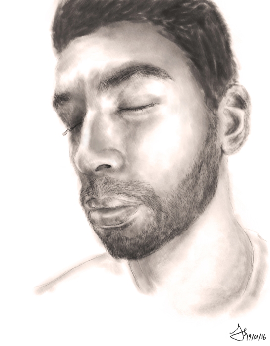
This chap might look familiar to long-time readers. What seems a very long time ago now, the beginning of November, I made a Time-Tested with he as the commanding subject. It seemed to go down very well, and as I’d had such fun working with him, I took the (most uncharacteristically) bullish step of getting in touch and asking if he’d be intersted in taking a couple more.

To my surprise, Keyon was not horrified, in fact he was very much up for it! After some pleasantly brief direction and discussion, I was practically inundated with photographs… well, twenty or so. They are all portraits taken in a similar vein to the Reddit exercise, showing a range of emotions and feelings. Here are the first two, which fell under the umbrella of ‘content’ – attempting to show happiness and serenity without smiling. With that sense of satisfaction and happiness in oneself and one’s situation, it seemed correct that I could get away with my traditional drawing style. Some others might demand something different, though, so watch this space!

The above is another foray into the wonderful world of Corel Painter, this time trying to use its pencil tools. This was, again, a very pleasant visual experience while also posing much more of a traditional challenge. I’m still dizzy by the amount of things you can alter in it – pencil type, softness, paper stock, they’ve thought of everything! In a subliminal honour of the work’s Time-Tested heritage, I did this relatively quickly – circa seventy minutes. I quite like the result, but I’m left wondering whether it actually says ‘content’, and whether I should have gone more delicately on it.

Below, we have a piece I made shortly after receiving the photographs, back in the realm of Photoshop, and taking far greater liberties with regards time limits, as I would hope is clear to you. For some reason I used Photoshop’s default brush instead of my own concoctions, giving it perhaps a less graceful finish and making some shading a bit choppy, but other than that it turned out quite well.

KT-1
My sincere thanks to Mr. Taravati for being so tremendously generous in his assistance. And indeed, with lots more photographs to get through, we will likely be seeing a lot more of Keyon here in the near future!

cacodemon-0
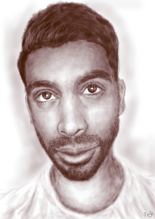
I’m sure you won’t mind me taking you back to the shores of Hell for another encounter with the loathsome Doom troupethis time, the Cacodemon. With their crown of horns, piercing green eye and mouth a perma-sadistic grin, these were indeed quite the unwelcome beast on first encounter, and every other that followed. I gave him fur, though I’m not sure he’s supposed to be furry. Oh well.

As you can probably gauge by the drawing, this beast does not amble around but instead floats, making evasion all the more difficult while also posing particular irritation if fending off others on ground level. They do not need to get close to mount an attack, either; they can take a chunk out of you with those huge gnashers, but they more often stay at long distance and belch balls of lightning in your direction. I shouldn’t imagine that’ll do you much good.

They’re by no means a ‘boss’ and as such aren’t terribly hard to best with relatively decent weapons, but that certainly doesn’t mean they should go underestimated, especially if facing a pack of them as often happens later in the game.

Caceys

You’re gonna need a bigger weapon.

In researching the development of the character, I found that the Cacodemon was basically lifted from the cover of the 1987 Dungeons & Dragons book, Manual of the Planes. Interesting to see…

AD&D_Manual_of_the_Planes

…goodness, it is the Cacodemon! Every day’s a school day. You may also be questioning the etymology of the name (though I doubt you’re much bothered). To be Susie Dent momentarily: The English word ‘cacodemon’ derives from the Greek ‘kakodaimon’, meaning ‘malevolent spirit’, which indeed is very suitable of such a monster. I’d long thought it a play on the general exclamation of the player whenever they appeared – that being, “oh, cack!” – but evidently I was wrong.

No doubt we’ll be making another plunge to the depths and meeting more hideous hellspawn soon.

fred-potu-CWith nothing else springing to mind and boredom edging dangerously near, I resorted to my nine-hundred-and-eighty-seventh attempt at Freddie Mercury, here taken from the Princes of the Universe video. This was drawn not in Photoshop but this time in a program I’ve never tried before: Corel Painter.

I’d heard a lot about it, and how excellent it apparently is for digital painting. I mean, I was just wandering around pressing buttons and not really having a clue – no change there! ahahaha – but it’s clear that such comments aren’t without foundation. There’s a huge box of tools for you to play with, but it’s when you start putting marks down that the fun begins. Unlike Photoshop, where layers are standalone, on Painter your brush strokes actually react to others as per the traditional medium. This means you get the pleasing mid-tones and also the terrifying, grotty, how-on-earth-am-I-going-to-rectify-that mistakes that are the norm for those woeful at traditional painting, as I am. Thankfully, like Photoshop, they have given you an eraser.

As I’ve said in the past, I don’t tend to call the works I generally put up here ‘digital paintings’, because they’re not really digital paintings, they’re digital sketches. I just create shades or highlights all one one layer (usually), and then optionally use Photoshop’s blending magic to place colour over the top. Having to switch tack and work like a painter is a bit of a kick up the arse, and a reminder that I’ve a hell of a lot to learn.

This was the product of me playing around with Corel Painter for a little while. Forgive the background too, chalk it up to experimentation. It’s not my best Freddie by any stretch, but it was a lot of fun watching the program blend the colours so intuitively, and it’s at least produced something different to the usual. I have thirty days left to break it, so we’ll see if anything betters comes of my dabbling. As for Painter, I’m not sure it could ever take Photoshop’s place in my heart, but I would definitely recommend a look to anyone interested in trying digital art. The trial is fully-functional and free for thirty days. Any artist who has cut their teeth on Photoshop won’t take long to settle in and it looks incredible – this is just scratching the very surface. If you know what you’re doing, you’ll have a blast!

sir-killalot-3A couple of days ago it was announced that Robot Wars is to be revived by the BBC after almost twelve years in the pit.

This is good news. I can’t claim to have ever been a die-hard fan of the show, but it was always enjoyable when I found it and so I’m pleased it’s going to find a new audience. Coming off the back of several successful tournaments in the US, Robot Wars began here in 1998. Kids and grown-ups alike spent months building the most impressive and fearsome beast they could muster, only to take it to the arena, slug it out against the far superior creations of others, and have your beloved bot – and dreams of glory – ruthlessly smashed to bits in seconds. Oh and Phillipa Forrester was on it, aswell. Great telly.

The most ominous presence during battle, though, was not likely to be your own adversary. One also had to steer clear of the dreaded but wonderfully unforgettable ‘house robots’, who quite obviously were far larger, stronger and more damaging than anything that was allowed of the contestants’ effort. They each spectated in a corner of the arena, and, if your robot came too close to them, it paid dearly.

Here, we have the big boss – the not overly knightly Sir Killalot, who made his debut in the second series. Packing an intense rotating drill in one hand and a ginormous cutting claw in the other, a close-up encounter was certainly not advisable. It’s not particularly advisable to draw him either – I think I could have built him in the time this took to complete!

To finish: Killalot wasn’t actually my favourite robot to ever appear on the programme. That honour goes to Wheely Big Cheese… for obvious reasons. I’ll leave you with a clip of WBC in action. Might Killalot interject?

Simply amazing.

reddit-15-70It’s a dreary, dreary January day, but hey, Time-Tested is BACK! (hears lone, distant woop) And on a Monday too, just to surprise you even more. I need to get back into these, and there’s no time like the present!

After a quick dusting and a new coat of glitter, the wheel commanded a time limit of 70 MINUTES for a drawing from the trusty Reddit Gets Drawn.

I admit I picked this handsome chap purely for his body. I’ve not done a figure study in a long, long time, and so this was a great opportunity to try one against the clock. With that objective in mind, I actually spent a relatively short amount of time on the face compared to my usual plan of attack, which might show a little, as it’s not terribly accurate. I’m happy to have made that compromise, though; working on the torso was refreshing, and of course a lot of fun. I continued my love/hate relationship with hands and feet; indeed, the left paw and flipper were cut from the photograph, and I half-heartedly tried to improvise them in the last few minutes, as it looked plain odd without them.

I coloured this one a little differently, as I began on a grey canvas instead of black or white as I normally do. With that, I drew both shade and highlight, rather than one or the other, which is something I’ve not done often in my time here. It’s given a pleasing softness to the contrasting tones and I think this works well for this job, ie rendering skin under intense time pressure and having to sacrifice extreme detail. It’s useful to have been reminded of that.

I did start to experiment with colours, which is why there is a curious glow and a slightly orange tinge to areas of our subject’s skin. Sadly, that was where the alarms started going off, signalling the end of the exercise. Oh well! Probably one of the more enriching TTs I’ve done for a long time (though I’m aware I probably say that every edition).

Until next time. Monday, Saturday, or whenever the heck it is! Wheel see you then!!!

topspin0089Yesterday’s journey to the funfair left me hungry for more. After all, you can’t take a trip to the amusements and only go on one ride, can you? What kind of stick-in-the-mud are you?

As the Ferris wheel is of the more gentle end of the spectrum, I decided to give it a more intense companion. Here we have the Top Spin, a ride which apparently has only been around since the early 90s – this makes their presence around here at that time seem all the more incredible. Indeed the model I’ve built used to frequent our annual Easter Fair in those days; as a child I used to love to watch the foolhardy thrill-seekers get thrown head over heels, screaming as their loose change and other belongings left them. I was an evil child.

topspin1_0140This was one of the harder to obtain, more expensive rides on RollerCoaster Tycoon and one of the ones that made your finicky guests quake in their boots, again unsatisfied with your provided entertainment because “it looks too intense for me!”, and those that did go on it ended up wandering around about to puke all over your precious pathways.

Again, a lot of fun was had here – and there were some skills learnt dealing with tapering parametrics for the shape of the arms, the gondola too was a serious modelling challenge as it’s quite a complex object, but I managed to get (kind of) there somehow. With the Ferris wheel ultimately quite bare in terms of design, I tried to include a lot more character here. I managed to cobble together a texture that emulates lights without actually being lights or even objects, which is probably an elementary technique, but to me it was a remarkable workaround! It made the lighting of the Top Spin’s arms and structure much friendlier in terms of build, render and performance.

topspin0164Indeed as render times weren’t horrendously bad for this, I have included a video, but as it’s getting late I decided to just do a quick 360-degree spin rather than a full ride sequence. Still, proof it works, which is more than can be said for the Ferris wheel!

Hmm, I might just stick to the trusty Dodgems if that’s okay!